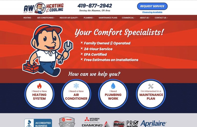
The AW branding has a retro feel, which is popular and effective in our industry. Vintage aesthetics work because they convey longevity, speak to the quality of service from the mid-century, and portray the company as friendly and approachable. The retro elements we added were star bullet-points, sunbursts, a cursive and sans-serif font combination, and of course their mascot. The subpage features an extra call to action for the phone number beneath the Hero. Repetition isn’t a bad thing in design – we think of it as another reminder to take action.
- URL: awheatingandcooling.com
- Location: Maumee, OH
- Launch Date: 07/15/19